Adrian Frutiger
Typography / System / Clarity / Motion

Adrian
Frutiger

Typography is not decoration. It is an infrastructure for understanding. This website explores how Univers and Frutiger transform type into systems of hierarchy, perception, and public communication.

Project argument

Univers represents rational system-thinking. Frutiger represents human-centered readability. Together, they show how typography shapes the way information is organized and understood.

Why this matters

Frutiger's work remains essential because it bridges modernist structure and real-world usability, making type both precise and legible across editorial, institutional, and wayfinding contexts.

01 / Overview

Designing clarity instead of noise

Frutiger's contribution to typography is significant because he designed typefaces that operate as systems of communication. His work demonstrates that typography can create order, reduce friction, and guide the reader through information with confidence.

Why Adrian Frutiger matters

Rather than treating letters as purely aesthetic objects, Frutiger focused on structure, balance, readability, and function. His typefaces are influential because they help designers solve real communication problems in both print and public space.
Core theme

This project argues that Frutiger shifted typography from static visual form to active information design. Univers shows how a type family can become a system. Frutiger shows how letterforms can support immediate recognition in movement and distance.

02 / Univers

A typeface built like
a framework

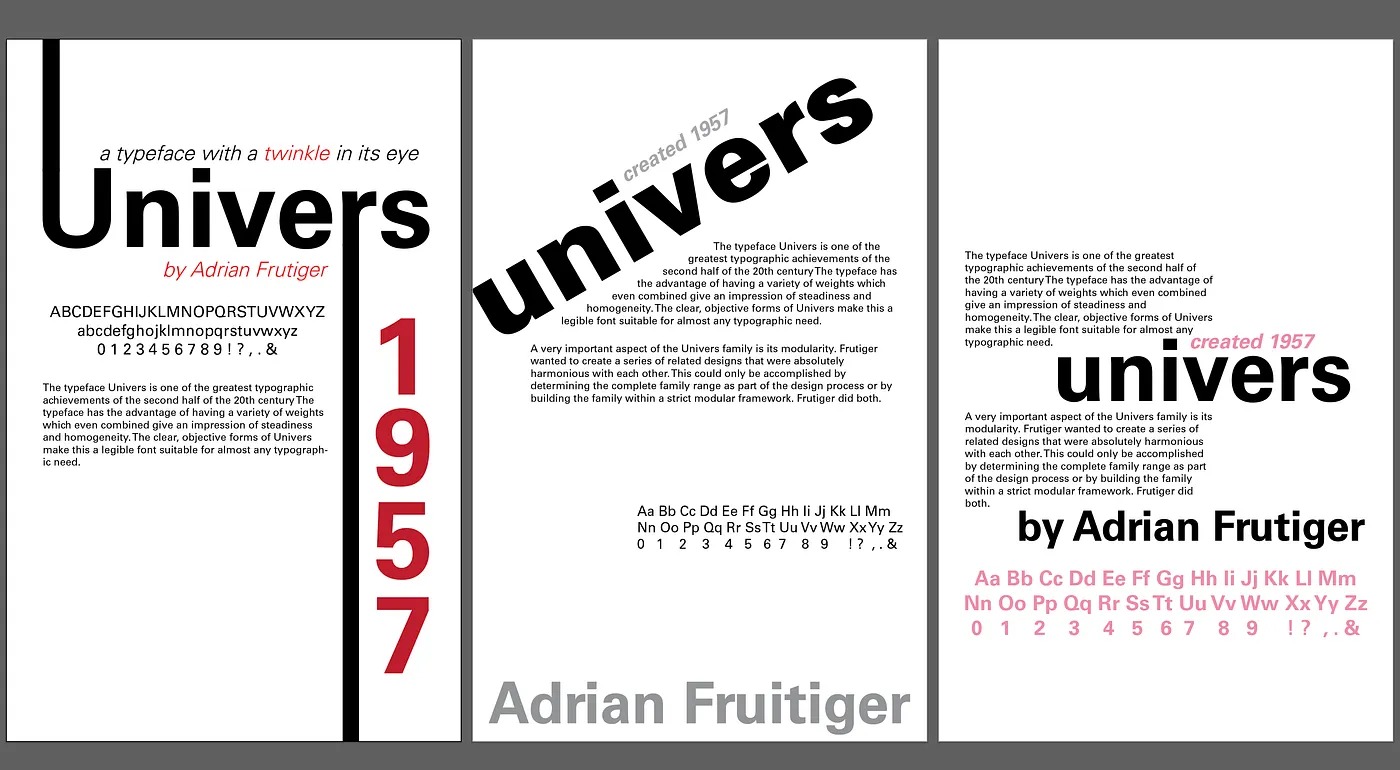
Univers is one of the clearest examples of systematic typography. Through its numbered family structure, Frutiger created a unified set of related styles that made hierarchy easier to control across complex layouts.

System logic

Univers
System

Its numbering system turns typography into a rational toolkit. Designers can move across weights and styles while maintaining a coherent visual identity.

45Light Roman
55Regular Roman
65Bold Roman
46Light Italic
56Regular Italic
66Bold Italic
Univers typeface sample
Figure 1. Univers typeface specimen illustrating systematic variation across weights and styles (Frutiger, 1957). Retrieved from https://en.wikipedia.org/wiki/Univers_(typeface)
03 / Frutiger

Readable in motion, distance, and stress

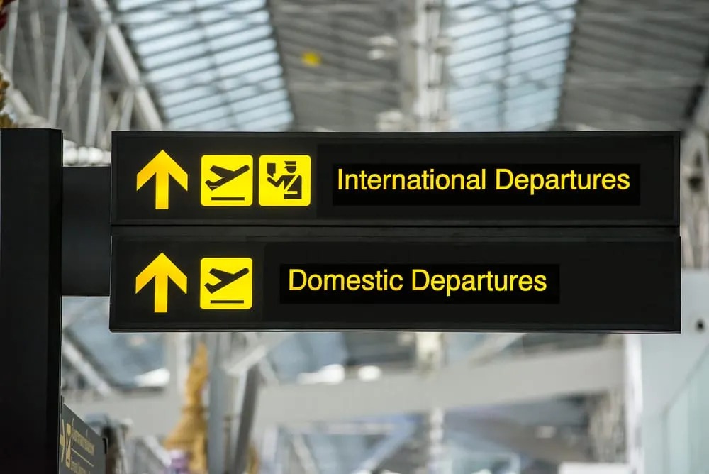
Frutiger was designed for signage environments where people need to process information quickly. Its open counters, clear spacing, and humanist forms improve recognition under real-world viewing conditions.

Terminal
A
Wayfinding demonstration
Departures500 m
Baggage Claim
Ground Transport
Open forms and strong distinction support quick reading in public environments.
Airport signage using Frutiger
Figure 2. Airport signage demonstrating the use of Frutiger for wayfinding and readability in public space (Frutiger, 1976). Retrieved from https://en.wikipedia.org/wiki/Frutiger_(typeface)
04 / Interactive demo

Test typography like
a designer

This live demonstration turns the analysis into interaction. Adjust weight, spacing, and size to see how typographic decisions affect hierarchy, tone, and readability. This directly interprets Frutiger's work through use, not only description.

Live typography study
Clarity
Typography succeeds when structure and readability work together. Univers creates order through system. Frutiger improves recognition through open, accessible forms.
05 / Comparison

Two answers to one communication problem

Both typefaces are functional and modern, but they solve communication differently. Univers emphasizes rational organization. Frutiger emphasizes immediate perception.

Univers

System

Univers builds consistency through structure, family logic, and controlled hierarchy. It is particularly effective in editorial systems and identity programs where order is essential.

Frutiger

Clarity

Frutiger improves readability through open counters, humanist forms, and strong letter distinction. It is especially effective in signage and environments where people read quickly.

06 / Insights

What Frutiger teaches contemporary designers

His work shows that typography is not neutral. The shape and structure of letters influence how people move through information, how fast they recognize content, and how confidently they navigate space.

Insight 01

Type creates hierarchy

Weight, size, and spacing can guide attention without relying on decoration.

Insight 02

Form affects speed

Open and distinguishable letterforms make reading faster in real conditions.

Insight 03

Systems build consistency

A type family becomes more powerful when it functions as a coordinated design tool.

Frutiger's legacy is not only that he designed beautiful typefaces. It is that he proved typography can act as infrastructure for comprehension.
07 / Recommendation

Evidence-based design recommendations

These recommendations are grounded in the evidence shown above: Univers demonstrates systematic hierarchy, and Frutiger demonstrates readability in public communication.

Recommendation 01

Design with type families

Use coordinated weights and styles to maintain hierarchy and consistency across interfaces.

Supported by: Univers system logic.

Recommendation 02

Test readability
in context

Evaluate typography at distance, under time pressure, and in imperfect conditions instead of only in clean mockups.

Supported by: Frutiger signage application.

Recommendation 03

Make clarity
the aesthetic

Let spacing, proportion, and contrast create sophistication instead of adding visual clutter.

Supported by: Both typefaces' communication logic.